Afterform
I explore how a fragrance identity can turn an invisible experience into an object worth keeping.
Independent creative direction, identity & campaign study
Original static design specimens · illustrative content · not a shipped product
01 / Idea, problem & leadership
What needed to change.
- My role
- Independent creative direction, identity & campaign study
- Disciplines
- Brand · Product
The central idea
My self-written brief gives a fictional fragrance house a recognizable presence across product, packaging and campaign.
- Designed for
- I imagine design-conscious fragrance buyers who approach scent through objects, ritual and personal taste. This audience is a hypothesis, not a researched segment.
- Scope of this study
- Independent creative direction · Identity and range architecture · Packaging hierarchy · Campaign art direction
- What is shown
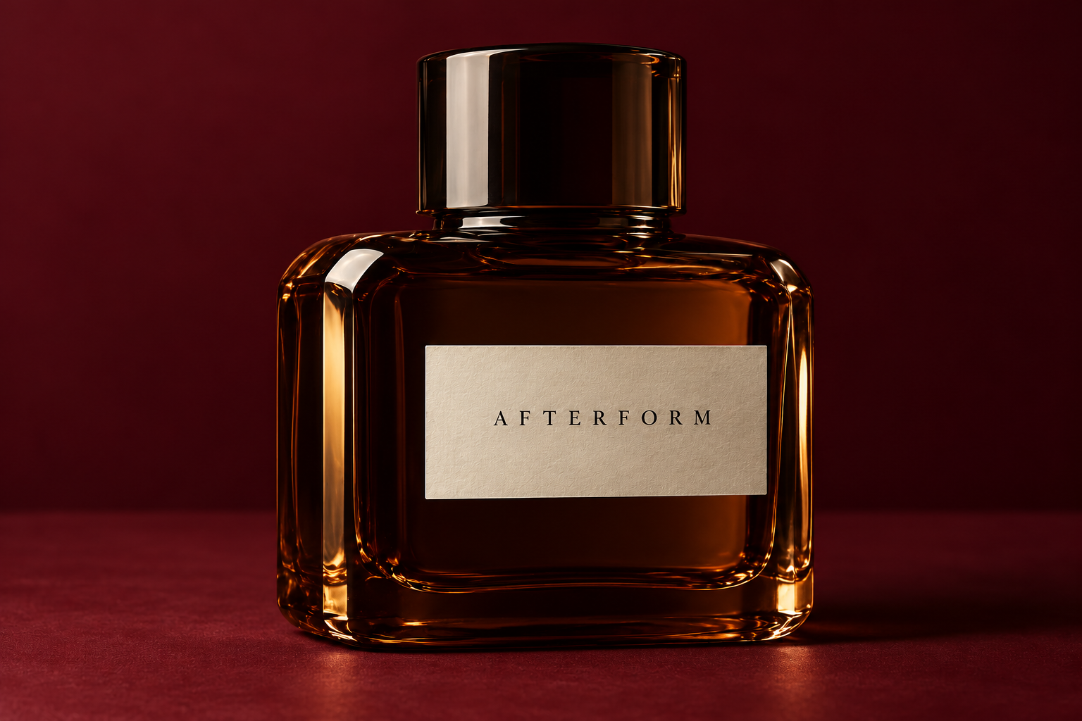
- I present one bottle image and original SVG identity and campaign boards. These are concept applications, not manufactured packaging, a formulated fragrance or evidence of commercial results.
Give the intangible a presence
I begin with the gap between seeing a fragrance and experiencing it. A compelling image can invite discovery, but it cannot explain the scent. My brief assigns those tasks different roles: a clear bottle silhouette creates interest, while clear identification and concise product information would support a choice. I want the identity to hold attention at a distance and reward a closer look.
02 / Thinking, evidence & concepts
Making the thinking visible.
These visual studies explore a design hypothesis. No interviews, usability tests or commercial outcomes are claimed.
One hierarchy, several applications
I connect a compact uppercase wordmark, generous ivory space and deep burgundy. Brown glass introduces light as a changing detail. My proposed system carries the same relationships into a label, carton and campaign layout. The identity stays stable while a future collection gains distinct names and numbers. Mood can remain open to interpretation; product identification needs to stay direct.
03 / Solidified direction
Sculptural scent and object editorial
I separate the invitation from the information: a composed bottle image creates atmosphere, while a quiet label and controlled hierarchy identify the product. Dark fields and deliberate highlights support the object rather than bury it. The challenge is balancing an evocative image with the practical clarity a fragrance range would need.
Current art-direction rationale · developed for this portfolio revision, October 2026.
Creative direction / Decisions
The choices behind the work.
Let the silhouette lead
I give the bottle a simple flat base and broad, beveled shoulders so its outline can read clearly on a shelf. The quiet label leaves that shape room to lead. The tradeoff is that recognition still depends on proportion and placement; shelf visibility and small retail thumbnails would need testing.
Keep the range readable
I propose fixed positions for the brand, fragrance name and number. This could support future extensions, but it requires disciplined naming rather than a different identity for every scent.
Separate atmosphere from detail
I use burgundy and brown for campaign imagery, then ivory for information. The dramatic crop cannot answer every buying question; straightforward product views and verified descriptions would need to accompany it.
04 / Final result & next test
A coherent concept. An honest next step.
The existing bottle image and original identity and campaign boards establish a fictional fragrance direction. They are visual concept applications, not a formulated scent, manufactured packaging or evidence of purchasing behaviour.
Test the quiet details
I would next test full-size label proofs, a carton layout and a responsive product page. My questions concern small-scale readability, differentiation between fragrances and consistent representation of dark glass. Manufacturing and labelling would need specialist review. The present study establishes visual direction; production feasibility, audience response and purchasing behaviour remain untested.
Motion treatments and further production remain planned. The static work above is the current deliverable.
Credits & context
Self-initiated spec work. Original identity and campaign compositions developed for this portfolio. The concept imagery does not document a real product launch, client commission, event or property.
Keep exploring