Soft Assembly
I explore a warm, flexible furniture-brand identity built from a simple modular graphic language.
Independent creative direction, identity & campaign study
Original static design specimens · illustrative content · not a shipped product
01 / Idea, problem & leadership
What needed to change.
- My role
- Independent creative direction, identity & campaign study
- Disciplines
- Brand
The central idea
My self-written brand brief uses rearrangeable graphic elements to make a furniture identity feel warm, open and adaptable.
- Designed for
- I imagine people furnishing changing spaces, smaller homes and multi-use rooms. This audience is unvalidated.
- Scope of this study
- Independent creative direction · Furniture brand identity · Modular graphic language · Schematic campaign layouts
- What is shown
- I present original SVG identity and campaign artboards using schematic furniture forms. These are graphic proposals, not product photographs, construction drawings or manufactured furniture. No ease-of-assembly, environmental or commercial results are claimed.
A brand that makes room for change
I start with the idea that rooms and the people who use them change. The creative challenge is to express flexibility without relying on an engineered product claim. I give the identity a warm editorial voice and a small set of graphic parts that can be composed differently. My aim is recognition across a catalogue, a campaign and a digital introduction.
02 / Thinking, evidence & concepts
Making the thinking visible.
These visual studies explore a design hypothesis. No interviews, usability tests or commercial outcomes are claimed.
A few elements, a consistent character
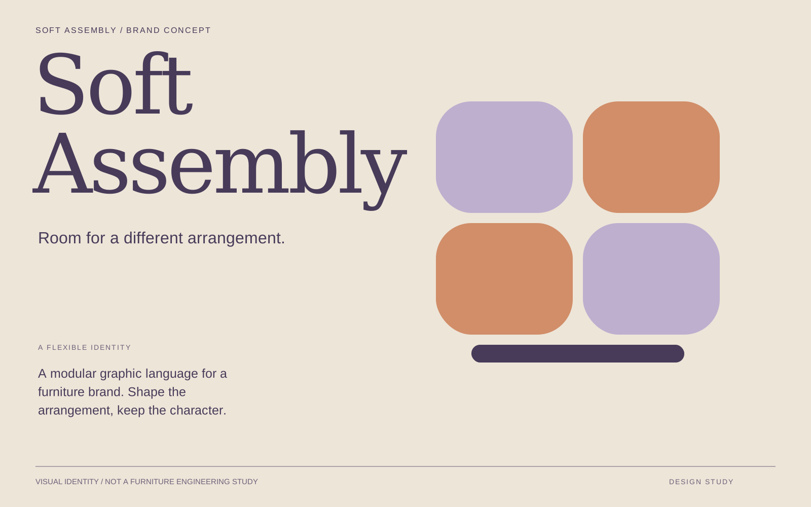
I build the graphic system from rounded rectangles, a title-case serif wordmark, and ink, lilac, clay and paper. The same modules reappear across the cover, the system board and the campaign compositions. Their arrangements create rhythm and variation. They are graphic elements, not construction drawings or evidence of interchangeable real-world furniture dimensions.
03 / Solidified direction
A warm kit of graphic parts
I express adaptability through a small, repeatable inventory of rounded modules and a welcoming typographic voice. Rearrangement creates variation while consistent proportions preserve recognition. The graphic system suggests changing domestic spaces without pretending to explain how a physical product is constructed.
Current art-direction rationale · developed for this portfolio revision, October 2026.
Creative direction / Decisions
The choices behind the work.
Balance warmth and structure
I pair a title-case serif wordmark with rounded modules on a consistent grid. The typography adds character while the grid creates order. The tradeoff is keeping those modules simple enough to repeat without becoming a second competing identity.
Use a limited, flexible palette
I combine ink, lilac, clay and paper. Swapping the background changes the mood while the proportions stay familiar. Future product information would need written identifiers and clear specifications; colour alone cannot explain a configuration.
Make the idea visible
I use original vector arrangements to express adaptability. These schematic shapes suggest a brand idea rather than a working furniture system. Product photography and configuration guidance would require actual product development and a separate production brief.
04 / Final result & next test
A coherent concept. An honest next step.
Original identity and campaign artboards use schematic furniture forms to demonstrate the brand idea. They are graphic proposals, not product photographs, construction drawings or manufactured furniture. No assembly, environmental or commercial result is claimed.
Test recognition before expansion
I would next test the identity in a small product tile, a printed catalogue and a legible information page. The questions are whether it remains recognizable and whether the expressive shapes leave enough room for practical detail. Dimensions, materials and engineering input would be necessary before a real configurator or specification. The current work establishes brand direction; product feasibility remains open.
Motion treatments and further production remain planned. The static work above is the current deliverable.
Credits & context
Self-initiated brand-identity study. Original schematic graphics and campaign compositions developed for this portfolio. This is not a furniture engineering or manufacturing project.
Keep exploring